
UI is hell: four-function calculators
One of the simplest and best-known computing devices on the planet is a fascinating study in interface design.
I have a thing for the history of calculators; they were among the earliest portable electronics, they pushed the limits of display technologies, and were the first digital computing devices to enter millions of homes.
Today, if you asked any self-respecting software engineer to implement a simple but backward-compatible button-operated calculator, they would probably roll their eyes and say they can get it done on a single lunch break. They would fail. I know because a while back, I built a calculator of my own design — and it’s been a ride.
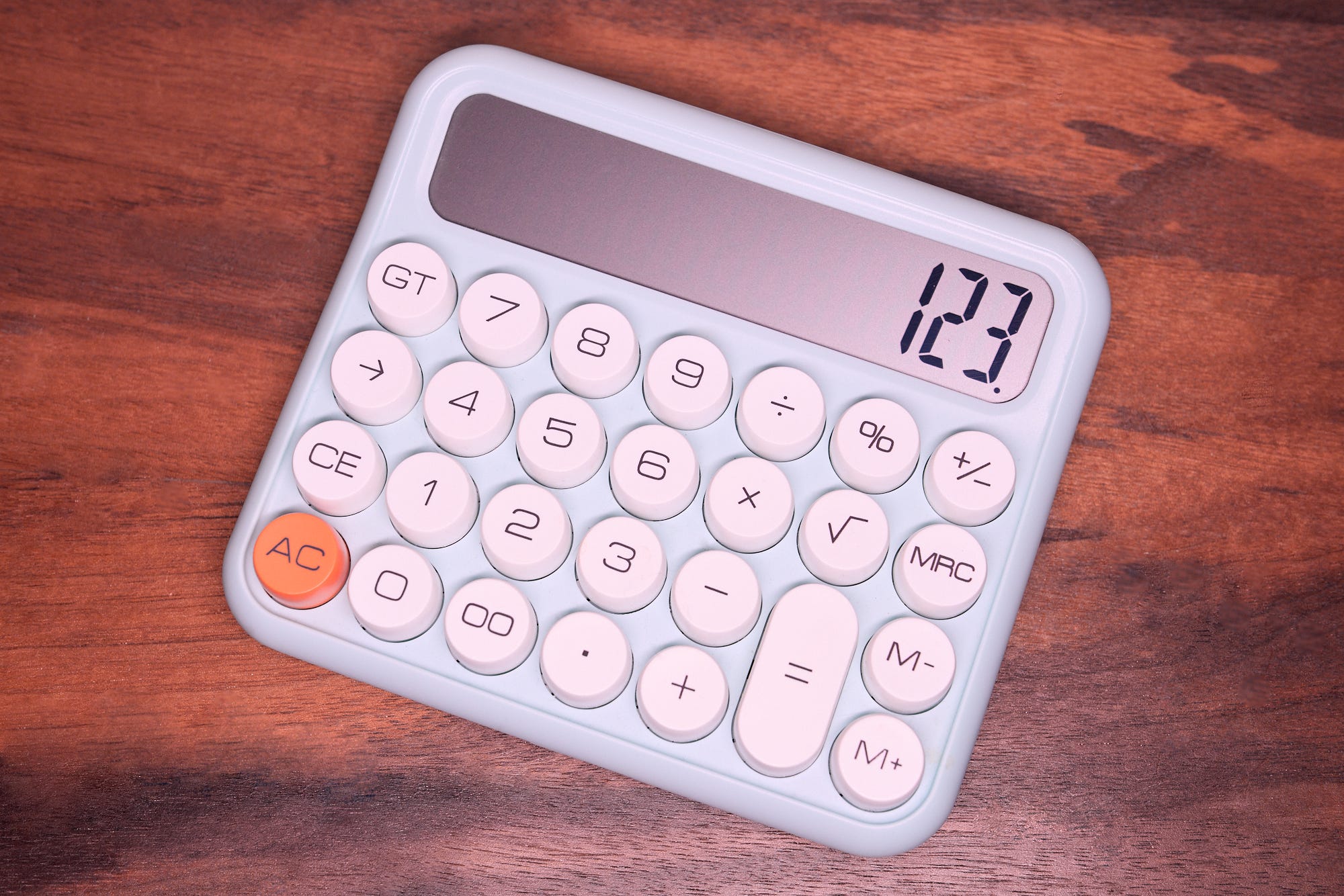
Let’s start with the basics: the simplest calculator has ten digit keys, a decimal dot, four arithmetic operators (+, -, ×, ÷), a result button (“=”), and a “C” key to reset state. It executes two-operand arithmetics sequentially, with no attention to precedence — e.g.:
We can easily imagine implementing this behavior with three variables: an input register, an accumulator, and an operator selector. The entry of every new digit shifts the contents of the input register one decimal place to the right. Selecting an operator loads this value into the accumulator and makes room for the second operand to be typed in. Finally, the user presses “=”; at that point, the result is computed and the value is put back in the input register, making it available for any subsequent ops:
But then… what happens if the user presses ⑨ right after the equals sign? The result probably shouldn’t be “159”. We need a special case: if a digit or a decimal dot is pressed immediately after some non-numerical input, the input register should be cleared. We can fix that with an additional “input reset” flag:
The added perk of the revised scheme is that we can keep the previously-entered operand on the screen for a bit longer in step 4, so data entry errors are easier to spot.
Done and dusted, right?
Well… but what if the user enters ② + ③ × ⑤ =? In the aforementioned scheme, we’d end up discarding the first addition and just executing ③ × ⑤ =. To address this problem, we need another special case: if an operation is already selected, we should implicitly press “=” before scheduling another one.
And what if the user enters ② × ÷ ③? They probably didn’t mean 2 × 2 ÷ 3! The most logical explanation is that they fat-fingered the operator and are trying to correct their mistake. So, we need another special case: that implicit “=” should trigger only if some numeric input happened in between — i.e., when the InR flag isn’t set.
But does the same explanation hold for ② × - ③? Is that an attempt at subtraction, or is the user trying to multiply by a negative number? Your guess is as good as mine; either way, the ability to specify negative numbers would be nice to have. Some calculators worked around the ambiguity by having a dedicated sign button; many didn’t, instead offering a special-cased unary suffix notation right before “=”:
The unary operator is a clever hack, but it leads to more UX confusion down the line. For one, it changes the sign of the entire expression, not just the preceding operand. For addition or subtraction, this produces mildly counterintuitive results:
Some users could’ve expected this to work differently: 10 + -2 = 8.
The problems don’t end there; we introduced a suffix method of changing signs, but it works only if it’s followed by pressing the “equals” key. In contrast, ② - × ② = is treated as an operator correction, not a sign change for the first operand. It produces 4 instead -4. Is that what the user wanted? There’s a fifty-fifty chance.
In the same vein, consider what happens if the user enters ② +, notices the last operand (“2”) is still shown on the screen, and hits “=”:
A reasonable person would assume they’re adding 2 and 2. But that’s not what happening here. The calculator interprets the input as a sign change from positive to positive (i.e., a no-op). Did we make things better or worse?…
If you ever played with an old calculator, you might have noticed a “feature” that lets you loop the last operation forever by repeatedly hitting “=”:
The mechanism is amusing but fairly useless, except for manual exponentiation. But there’s more to the story: it’s actually a side effect of a little-known “K-constant” feature that retains one of the previously-entered operands and the operator, and lets you vary the other operand. It was meant for calculating interest or surcharges, e.g.:
In the first line, we define a constant surcharge (“10”) and select the operation (“+”). From that point on, we can just keep entering the second operand and pressing “go”. Nifty, huh? But this means that our initial algorithm was wrong again: the accumulator and the operator selector can’t be cleared after “=”.
In this scheme, the second operand is used as the constant element when performing division, addition, and subtraction; but for historical reasons, multiplication plays by different rules:
And this… has rather hilarious consequences if you’re just mashing the “=” button and expecting consistent UX:
Oh, and hey — remember that “unary suffix” notation for sign changes? In many calculators, there’s another special-case for the division operator (but not for multiplication). The result is this overall usability gem:
If you’re scratching your head, the unary division operator gives you a reciprocal. It also lets you reverse the normal order of division, like so:
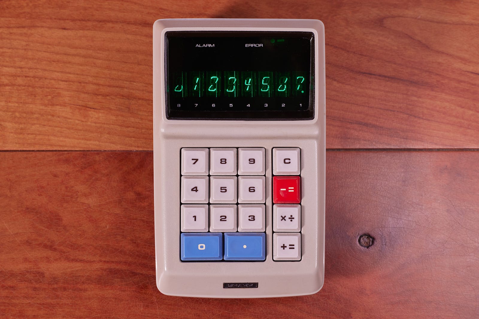
Keep in mind that this user interface, with all its gotchas and quirks, is the outcome of decades of product evolution and market research. Some of the early calculators from the 1960s and 1970s had even more perplexing input schemes. See if you can make sense of one of the gems in my collection — Sharp EL-8:
I write well-researched, original articles about geek culture, electronic circuit design, algorithms, and more. If you like the content, please subscribe.
Spoiler about the EL-8: the [+=] and [-=] buttons are just combined "calculate and show result", so you could do [2] [+=] [2] [+=] for 2 + 2, or 2 [-=] 2 [+=] for 2 - 2. As for [×÷], the function is chosen depending on whether the next operation is [+=] (selects multiplication) or [-=] (selects division).
More general postscript: to be fair, what's outlined in the article is not the only input scheme; that said, it *is* the dominant implementation you get if you buy a cheap Chinese "standard function" calculator on Amazon today. In the 1990s, the behavior was what you'd get from brands such as Panasonic. Casio had their own approach.
And of course, yep - there were odds and ends like RPN. But if we're talking about consumer products, immediate execution (with quirks) ruled supreme.
Maybe some malfunctioning in my UI rendered most of the images as blank, white rectangles.