Fractals #2: understanding Mandelbrot
The Mandelbrot fractal is known to almost all computer geeks. But where does its complexity come from?
In the previous article, I talked about one of my favorite mathematical constructs: the Buddhabrot fractal that’s hiding in the shadow of its better-known cousin, the Mandelbrot set. Both of these sets are described by the same formula:
In this formula, c and z are complex numbers, the math of which is explained in the aforementioned article. For each screen pixel coordinate c, the system is iterated starting from z0 = 0 to see if zn escapes a certain radius. To calculate the Mandelbrot set, we simply take all the pixels that produced non-escaping trajectories.
This algorithm is easy to implement if you know the basics of computer programming. What’s harder is to grasp how all this otherworldly, two-dimensional complexity could arise from a simple calculation. In today’s article, let’s have a look at that.
The rabbit-breeding ecosystem
Let’s start with a seemingly different construct known as the logistic map. It is an iterative, real-numbers-only formula that has its roots in an attempt to model population dynamics in an ecosystem that can only support a certain number of individuals:
The fundamental idea is that in every iteration, the population increases by some constant multiplier k; this is the kxn expression. At the same time, more individuals die as we get close we are to the ecosystem’s carrying capacity. That’s the (1 - xn) part.
It should be clear that when xn is very small, the formula is approximately xn+1 = kxn. Conversely, as we approach the ceiling, the culling gets more violent. The boundary behavior is a total population collapse: xn+1 = 0 if xn = 1.
Quick experimentation reveals that the system is stable for k values between 1 and 3; in that range, the population increases monotonically with k. The limit is a population of 2/3 as k approaches 3. We can show that this is an equilibrium point:
As we sail past this threshold, the system starts to oscillate, with alternating cycles of die-offs and growth. For example, at k = 3.235, we have a repeating period-2 pattern of:
To understand what happens next, it’s helpful to make what’s known as a bifurcation diagram — a scatter plot of iterated population values (vertical axis) for every k (horizontal axis). Any starting x0 greater than 0 and less than 1 will do:
We can clearly see stable populations up to k = 3, followed by period-2 oscillations up to k ≈ 3.45… then a period of 4, and 8, and maybe 16, and… huh?
As it turns out, past k ≈ 3.57, the system falls into a peculiar chaotic state — still deterministic, but with no finite oscillation period and no other discernible pattern of behavior. On a couple of occasions, it briefly reverts to periodic operation, but this never sticks. What’s going on?
Cobwebs to the rescue
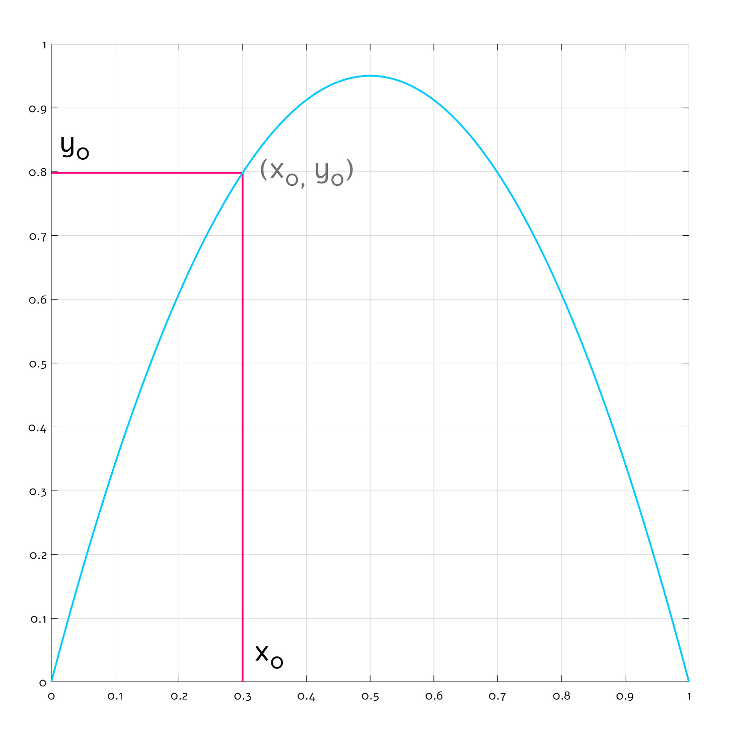
To make sense of the mess, we can employ another cool tool: the cobweb diagram. The logic of cobweb diagrams isn’t explained well on Wikipedia, but we can fix that. Consider this conventional y = f(x) function plot:
It should be clear that if we want to find out the value of our mystery f(x) function for a particular x0, we just need to start drawing a vertical line from the chosen value on the x axis. The line intersects the blue function plot at (x0, y0) — and by the nature of function plots, y0 = f(x0). From that intersection, we can start drawing a horizontal line to the left, hit the y axis, and read back the result.
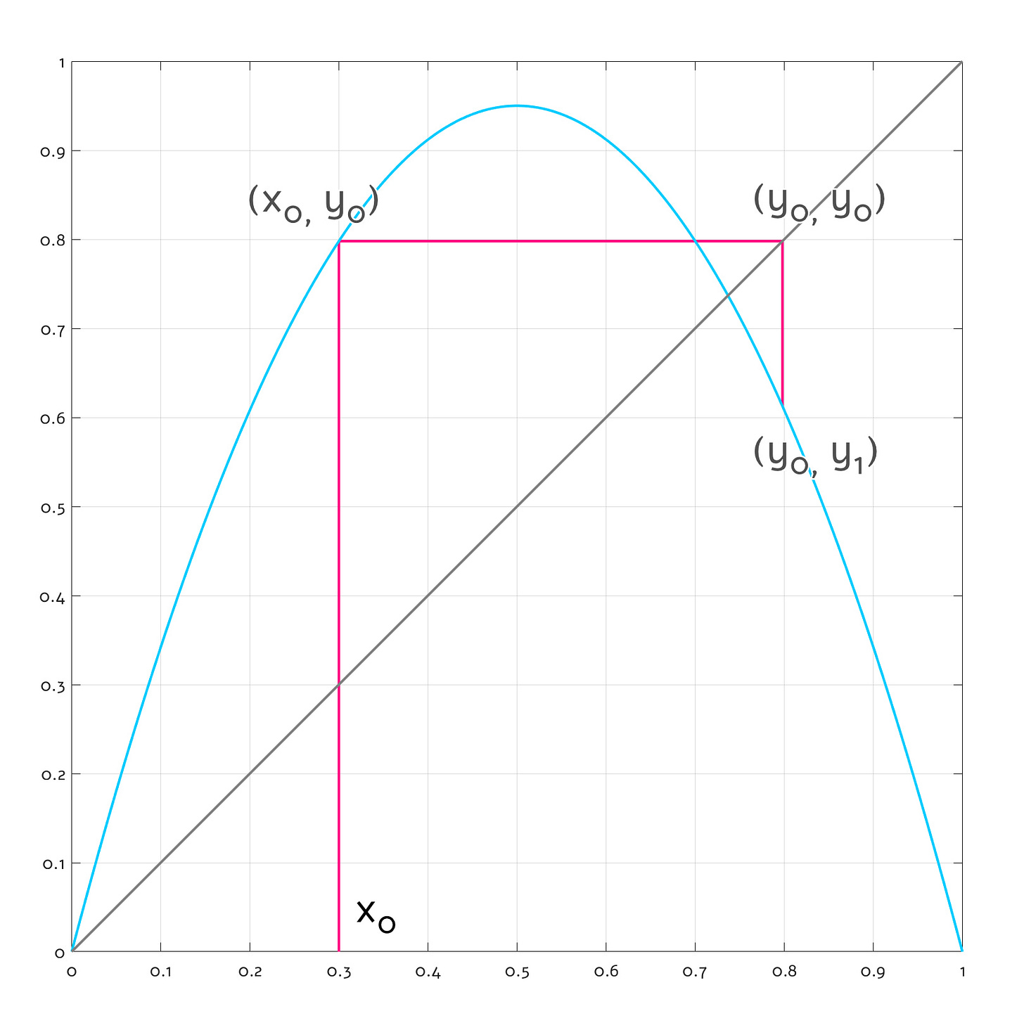
A cobweb diagram works similarly, except it uses a bit of geometry to project the previous result back onto the function plot itself. We start by adding a diagonal line to the graph; the line is essentially a plot of y = x.
Next, we draw the first vertical line as before, finding an intersection with the function plot at (x0, y0) where y0 = f(x0). But instead of turning toward the y axis and calling it a day, we draw a horizontal line toward the diagonal. This second line has a constant y coordinate — y0 — so when it intersects the diagonal, it necessarily happens at x = y0 (remember that the diagonal is a collection of points satisfying the criteria that y = x). In effect, the operation “copies” the original function result from y to x, producing a point at (y0, y0):
Next, we start drawing a third vertical line toward the function curve. Once again, this intersection necessarily happens at y = f(x). Because the x coordinate of the third line is constant and equal to the “copied”, previously-computed function value — y0 = f(x0) — we essentially found y1 such that:
Neat — we looped the function back onto itself. With just a pencil and a ruler, we can iterate this system for as long as we want.
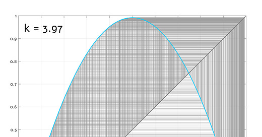
Or, we can ask a computer to do this for us. Here’s a sequence of cobweb diagrams for the logistic map across increasing values of k:
Observe that the first bifurcation happens precisely when the function curve is perpendicular to the diagonal line; at that point, convergence is no longer possible and two nearly-identical inputs can be “reflected” in two opposite directions. With increasing curvature, the number of these bounce singularities grows and quickly approaches infinity — at which point, no finite period can be seen. Later on, the angles snap into alignment for a couple of fleeting moments, but this doesn’t last.
Back to the Mandel-dude
I know I promised to explain the Mandelbrot set, and at this point, we probably have some readers asking for refunds. Well — prepare to have your mind blown:
Yep. Every single feature of the set along the real axis (y = 0) — down to each tiny bump on the “antenna” — corresponds to a discontinuity in some sort of a bifurcation diagram. In the centers of the diagram’s stable regions, the Mandelbrot set reaches its maximum width, suggesting the formula’s low sensitivity to the vertical (imaginary) part of the starting coordinate. In contrast, near the singularities and in the chaotic zone, the set’s width is zero, implying that even the tiniest perturbation in the imaginary axis produces a runaway trajectory.
To understand the relation between the set and the mystery bifurcation diagram, recall the original Mandelbrot formula:
Let’s say we just want to calculate a single row of pixels along the real axis — a “Realbrot”, if you will. In keeping with the z = (x, y) and c = (u, v) convention from the preceding article, we can simplify the equation to this:
It’s not the formula for the logistic map, but if we compare the cobweb diagram layout of the two, it’s clear that they walk and quack the same:
Here’s the actual bifurcation diagram for Realbrot. It’s flipped and has slightly different proportions, but it’s fundamentally the same deal:
For what it’s worth, we don’t have to limit ourselves to the real axis: we can work with complex numbers to solve for non-zero y coordinates. That said, the results are disappointing: as soon as you deviate from the y = 0 line, you see simple periodic oscillations when crossing the body of the set, and then featureless runaway trajectories when slicing through the empty regions:
The spooky realization is that the only interesting linear slice of the Mandelbrot set is that central line. The entire two-dimensional fractal is just some crazy projection of that one-dimensional bifurcation pattern into the surrounding space.
But how…?
Most readers probably remember that complex numbers are constructed by taking two real values and then multiplying one by a special symbol (i). This allows tricks such as representing a pair of Cartesian coordinates as a single number (z = x + iy) — and keeping the x and y values at an arm’s length.
Importantly, i is not just as an abstract symbol; it’s equal to √-1. Ordinarily, you can’t do much with that, so it just sits there and keeps the values apart. But it can turn into a real number in some circumstances — for example when multiplied by itself (√-1 × √-1 = -1). This property gives rise to a number of useful geometric transformations, such as translation (via addition), scaling (via multiplication by a real number), rotation (via multiplication by a power of i), and…
Right, squaring: the operation doesn’t simply move, scale, or rotate shapes — it bends, twists, and spins them in complicated ways. Watch the following animation to get a sense of just how weird it is — the original objects are blue, while the pink shapes correspond to the squared form:
You can even catch a glimpse of Mandelbrot’s main cardioid at 0:06 and 0:09. This transformation is the reason why the Mandelbrot set — with its z2 expression — has a structure far more complex and mind-bending than just some obvious repetition of the logistic map.
Heck, by cycling through exponents (z = zm + c), we can observe how the fractal gradually spills out of the real axis. Between m = 1 and m = 2, it develops its usual shape. The animation continues all the way to m = 5, producing a sequence of many-lobed “Multibrots”:
The reliance on geometric transformations in the complex plane is also why we don’t know how to construct a canonical 3D equivalent of the fractal: we don’t have a three-variable system that coherently implements this sort of geometry. The closest we came up with are four-variable quaternions, but this approach yields a four-dimensional set. We can render three-dimensional slices of that shape, but they’re dull-looking solids. It’s akin to staring at one-dimensional slices of the standard Mandelbrot.
PS. To answer one lingering question: yes, you can compute a Mandelbrot-style fractal using the logistic map as the basis function. At z0 = 0.5, it looks quite similar, except for complete biaxial symmetry:
👉 For a thematic catalog of articles on this blog, click here.
I write well-researched, original articles about geek culture, electronic circuit design, algorithms, and more. This day and age, it’s increasingly difficult to reach willing readers via social media and search. If you like the content, please subscribe!


Here's another cool animation - the impact of shifting the starting point (z0) for Mandelbrot set:
https://vimeo.com/936068771/14ff98eadb
PS. If you liked the f(z) = z^2 video toward the end of the article, you might also enjoy playing with this interactive conformal map demo done by another person: http://www.rotormind.com/projects/portfolio/codework/conformal/
Thanks! As a pupil in the 80s I experimented calculating the Mandelbrot set and looked into the algebraic formula of the cardioid to save compute time (10s of minutes then) in the boring non-divergent part. My math skills were too low to properly understand it then, but your article made me look it up and let me find http://cosinekitty.com/mandel_orbits_analysis.html . It's also interesting how much of the marketing aesthetics around chaos theory is based on relatively simple things like the behavior of squaring complex numbers and combining several things (up to fancy color schemes). Your article also made me quickly install xfractint again and draw a KAM torus, which happens to be one of my favorites.